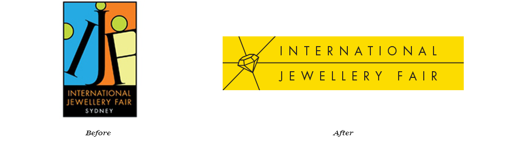
In 2017 I was asked to update the International Jewellery Fair branding and logo design. The event had just moved back to Darling Harbour, in the new ICC Sydney, and the logo and branding needed an update, to reflect a contemporary international trade show being hosted in the new world class venue.
The logo design process went through several iterations, with consideration given to a range of styles. The final design chosen was simple, clean and contemporary, using a strong yellow and black palette.
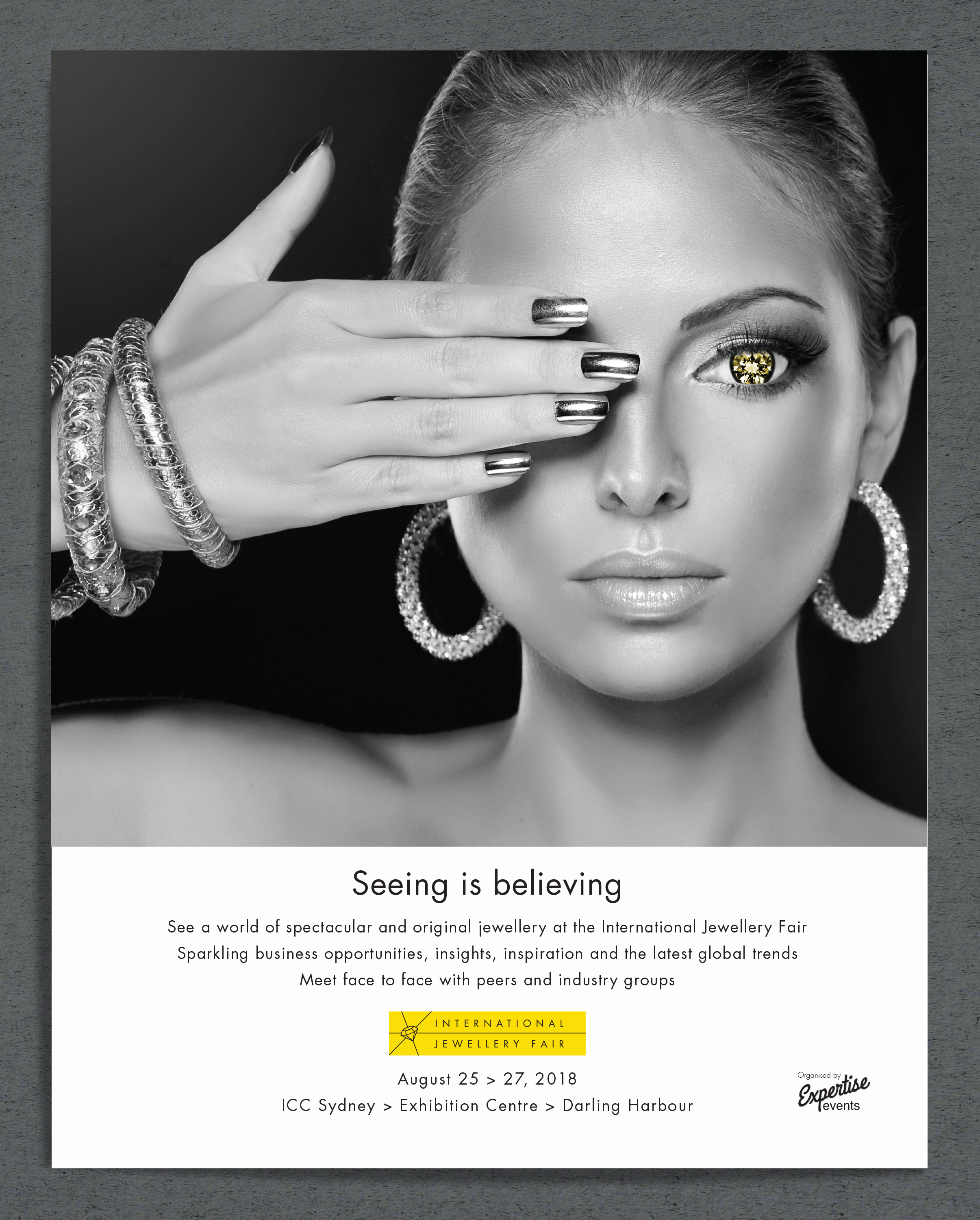
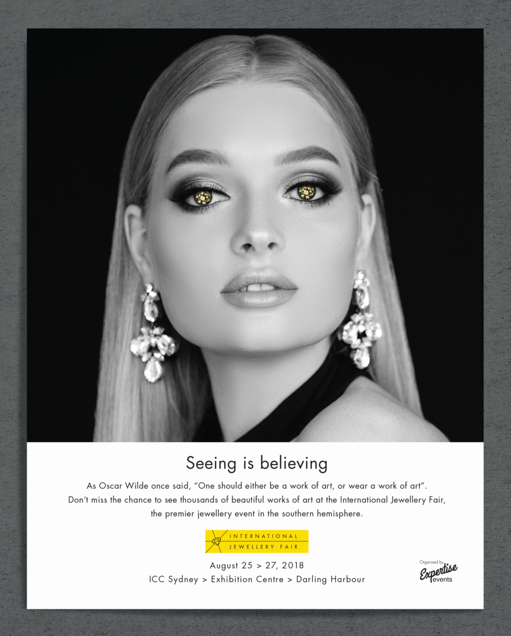
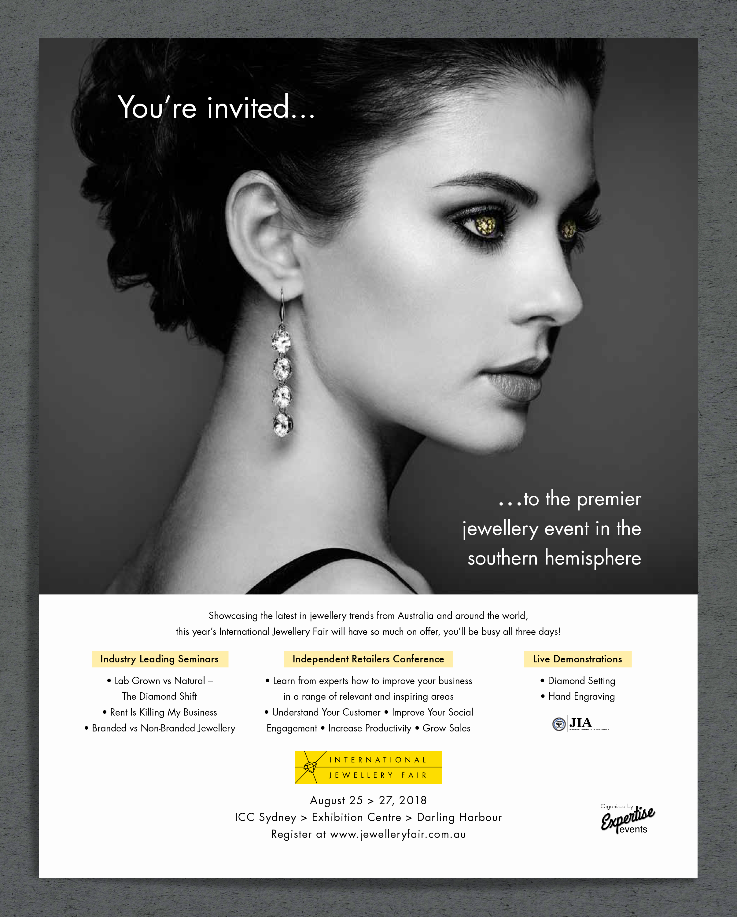
After the logo was chosen I was asked to work on a creative campaign to promote the 2018 event. The new logo lent itself well to the use of strong black and white imagery so I decided to work within those parameters. My brief was to show jewellery, although it could not be any particular exhibitors jewellery, and I was asked to add some glamour and sophistication, and to make it different. Distinctive.
I achieved this by using strong black and white images of sophisticated women, and reinforcing the yellow logo with the yellow diamonds in the subjects eyes. ‘Seeing is believing’ was the tagline, the key message being that you have to be at the show to fully experience it, and that whether a visitor or an exhibitor, you need to be there. I worked on this campaign and designed the key visual using the yellow diamonds in the eyes of the subjects.
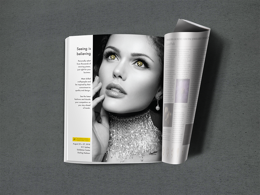
Each of these were full page ads in the trade magazine Jeweller, the above mockups showing how they appeared in the magazine. The campaign gained good brand recognition over the months leading to the event. The images were also used on the website to promote the 2018 event, and on the signage at the event. In the final month of the ad campaign the reader is reminded of the conferences, seminars and demonstrations they can see at fair (see bottom of page).
As well as the press campaign, I translated this campaign design for the social media and digital advertising collateral.

Category: Branding, advertising
Format: Print, digital, signage